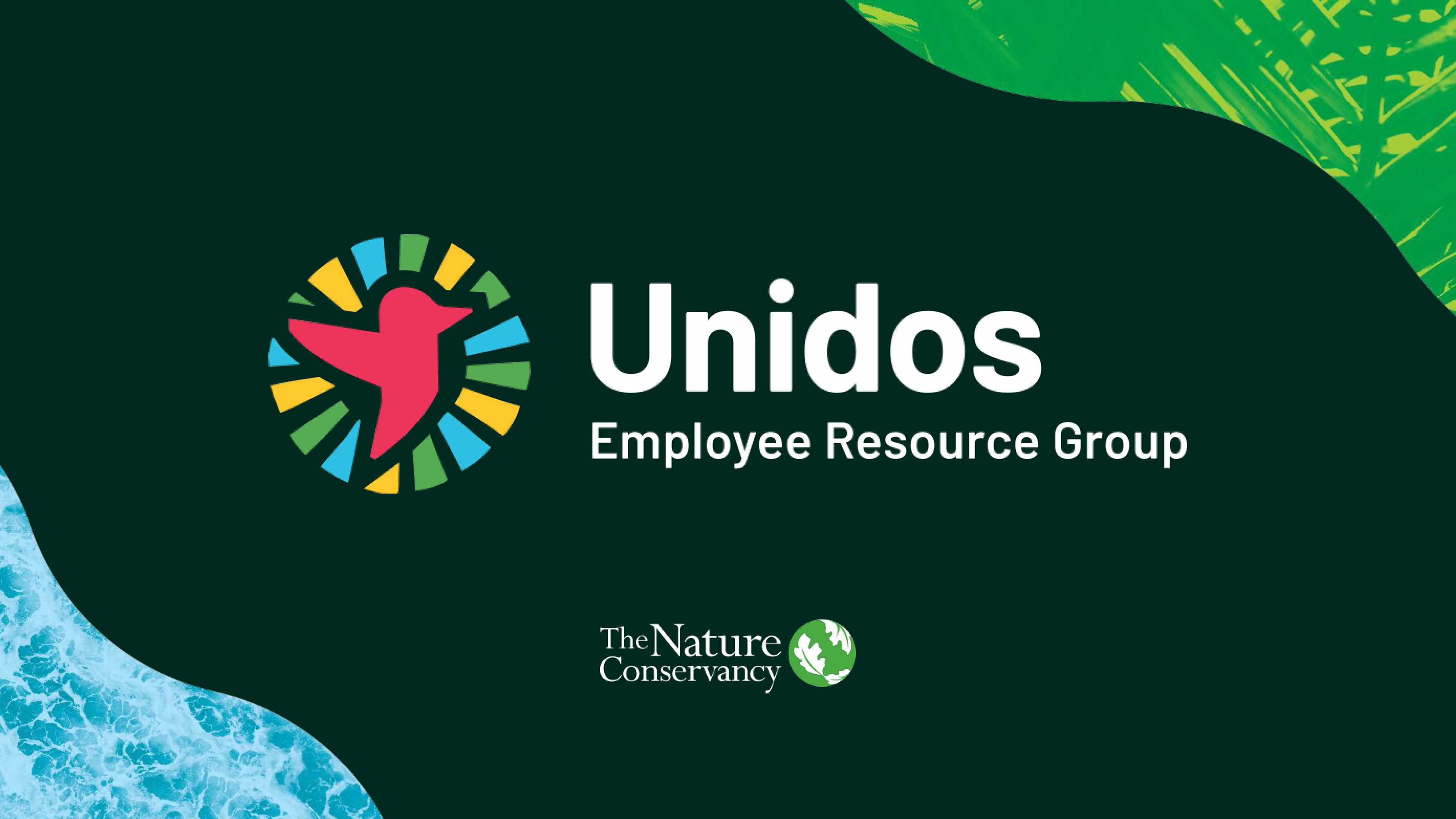
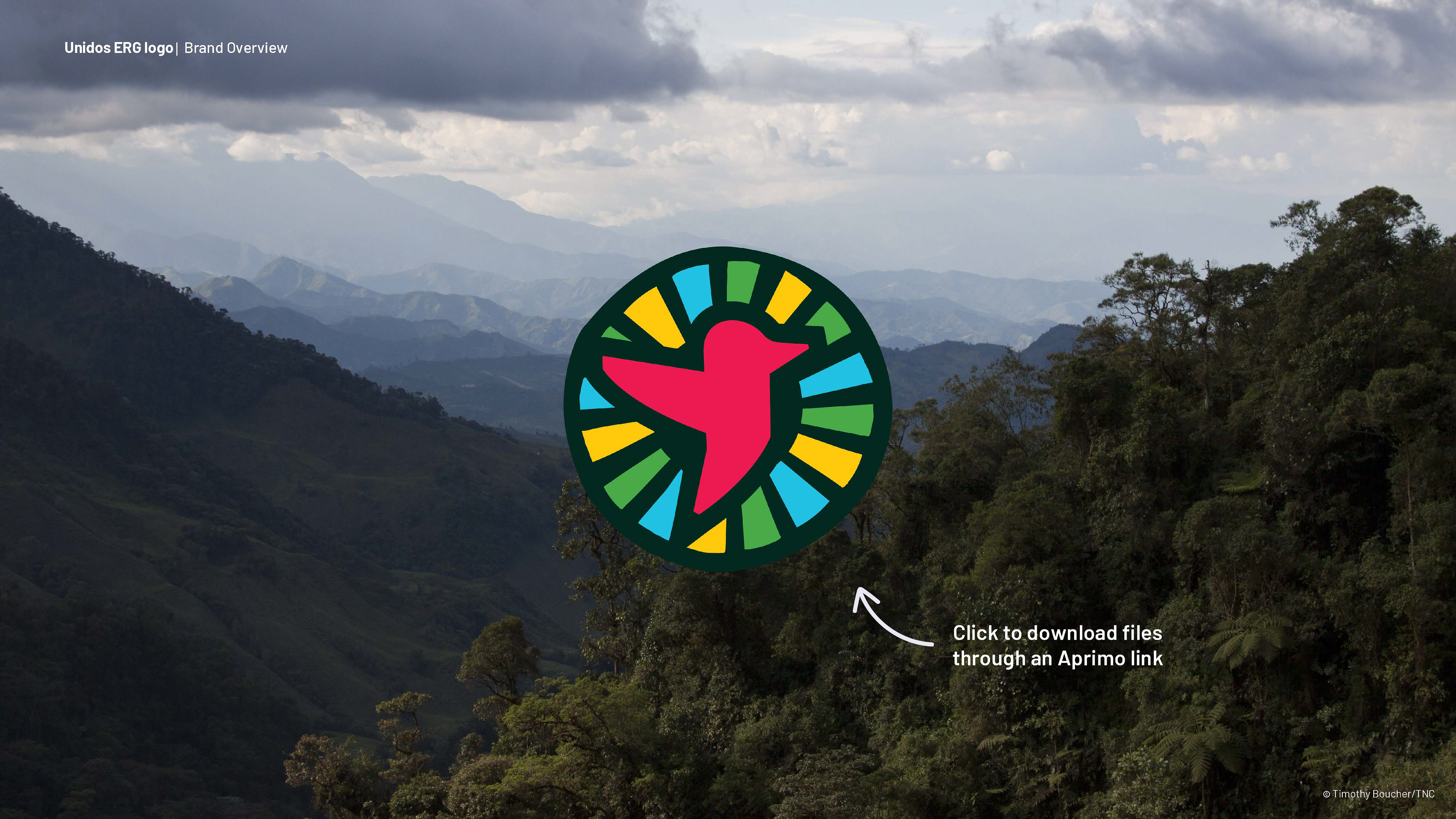
Background: The Nature Conservancy wanted to develop a logo that would go hand in hand with the development of an ERG aiming to create a community for Latin America and the Caribbean within the organization to empower and recognize employees from the region.
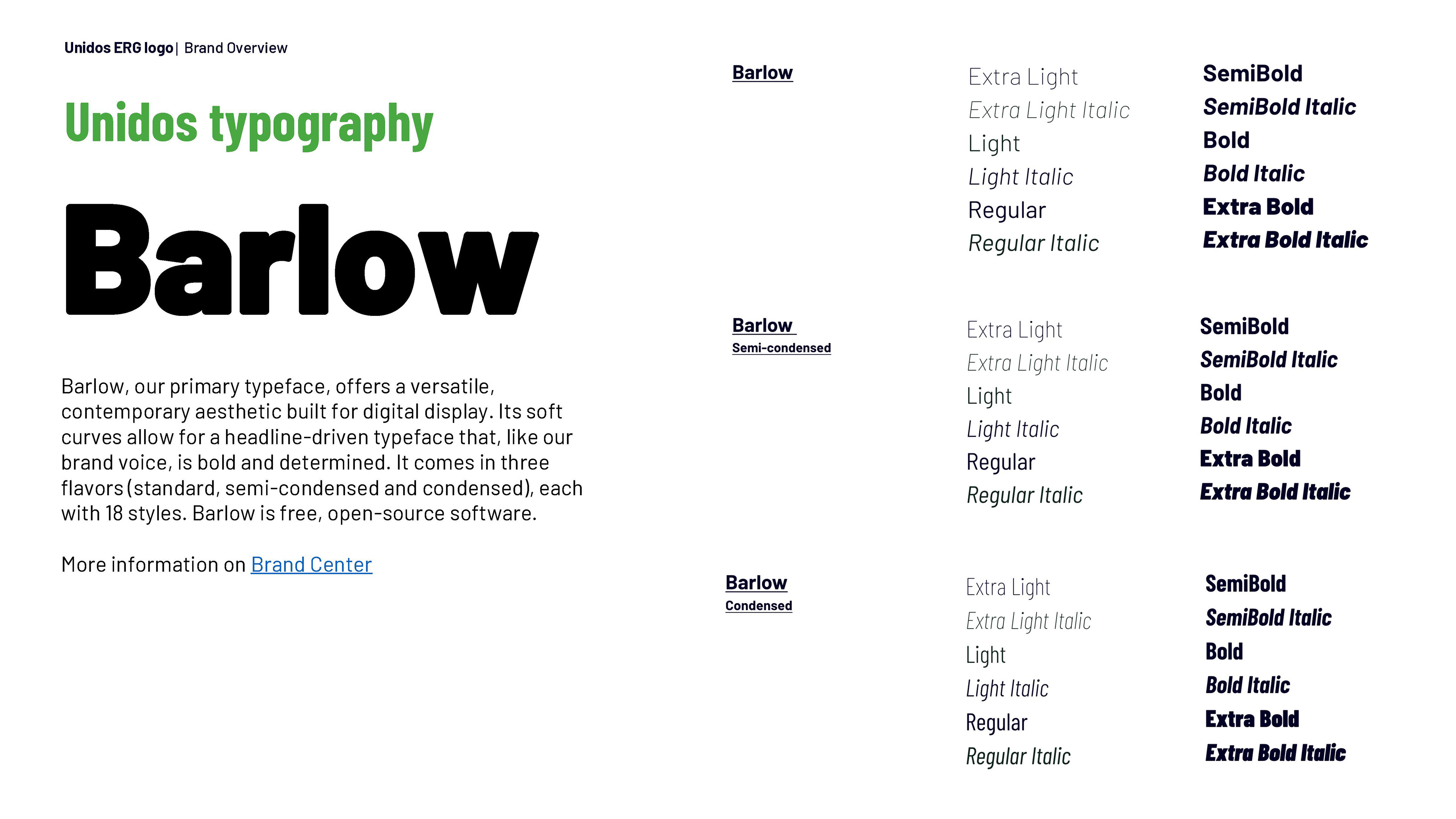
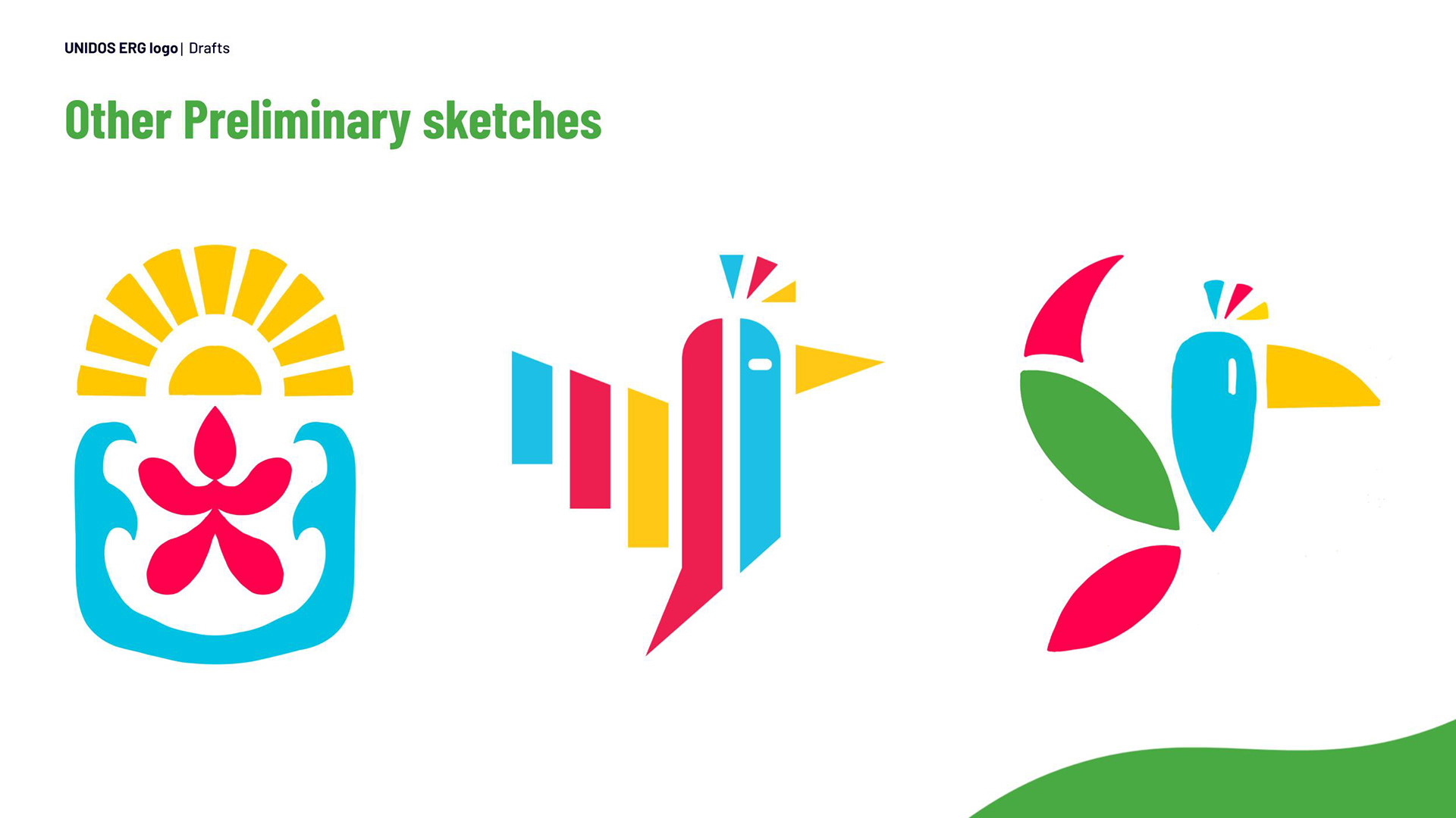
Process: This branding project involved researching the visual landscape to guide creative direction. Initial sketches and multiple concepts were developed to explore a strong visual identity aligned with The Nature Conservancy's existing brand standards, while reflecting the ethos of an employee resource group focused on empowering Latin American and Caribbean communities.
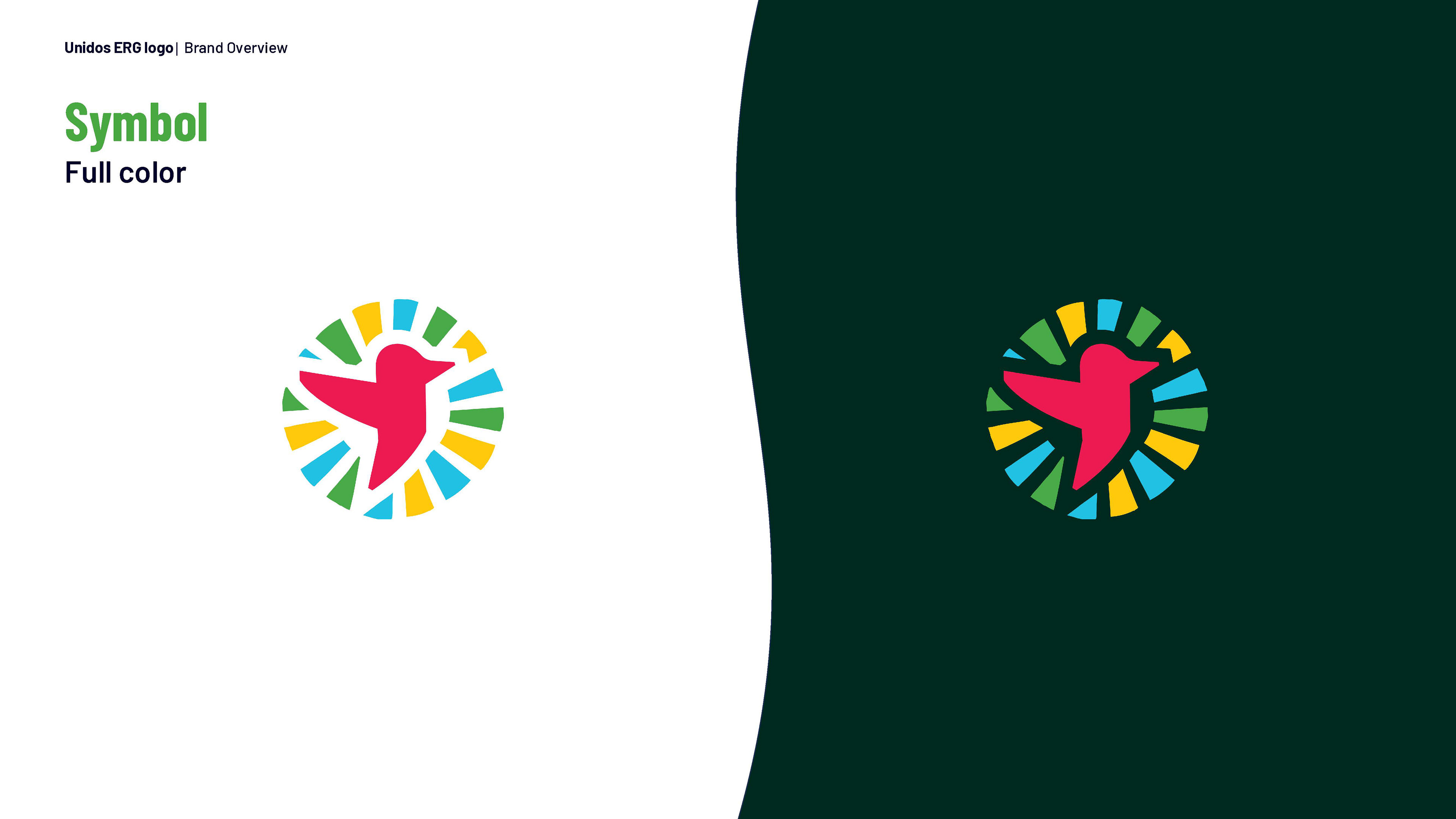
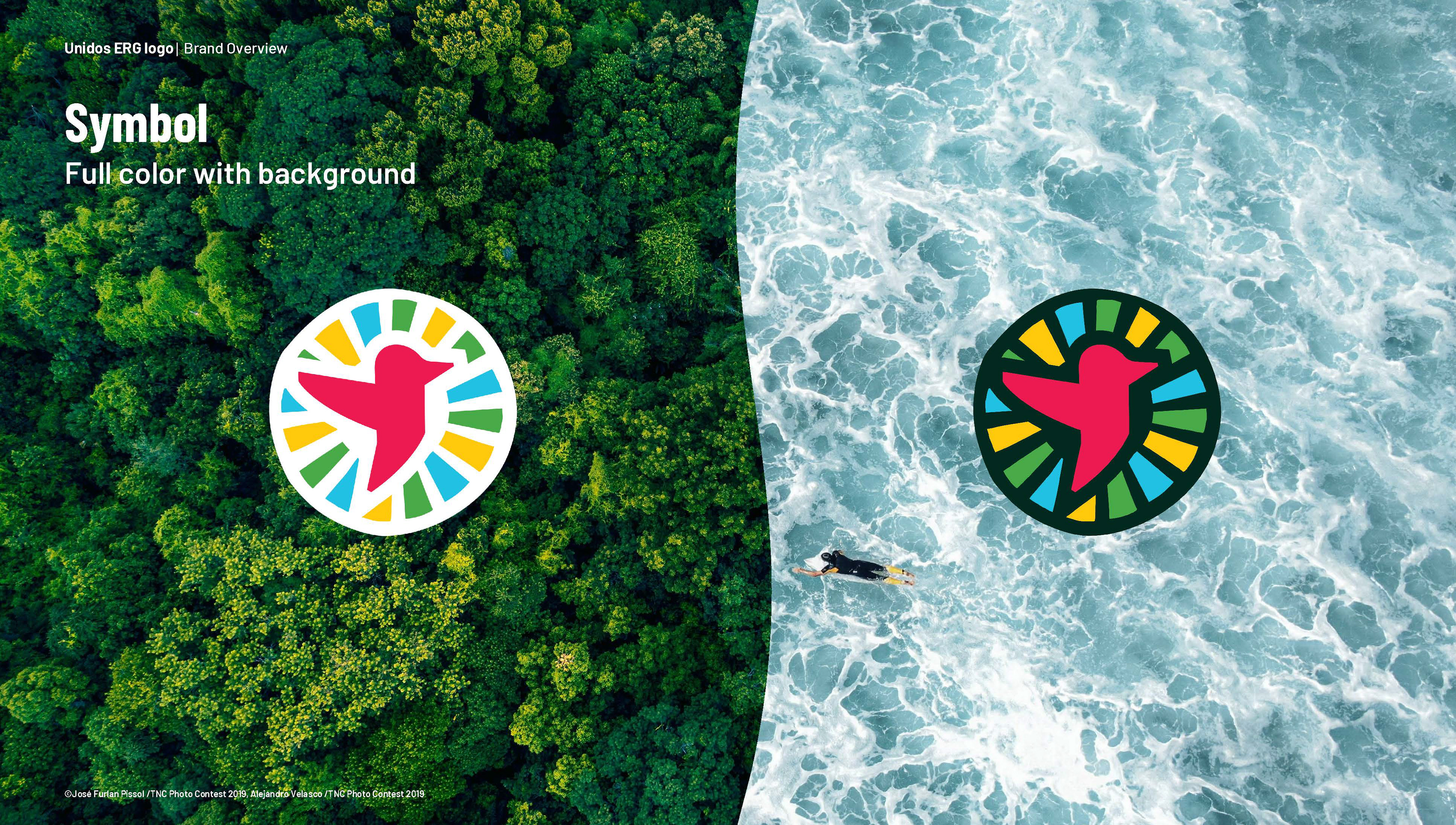
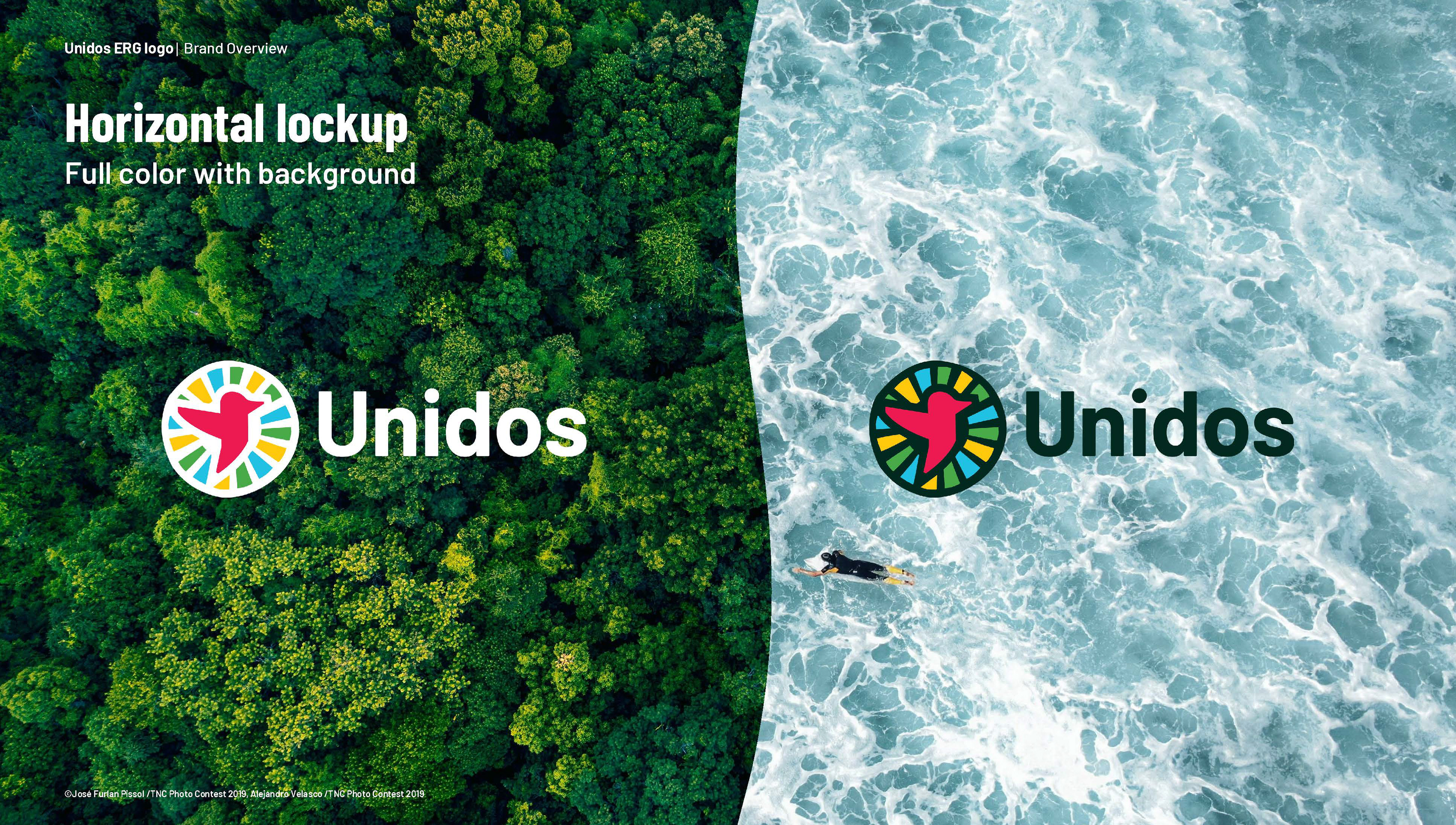
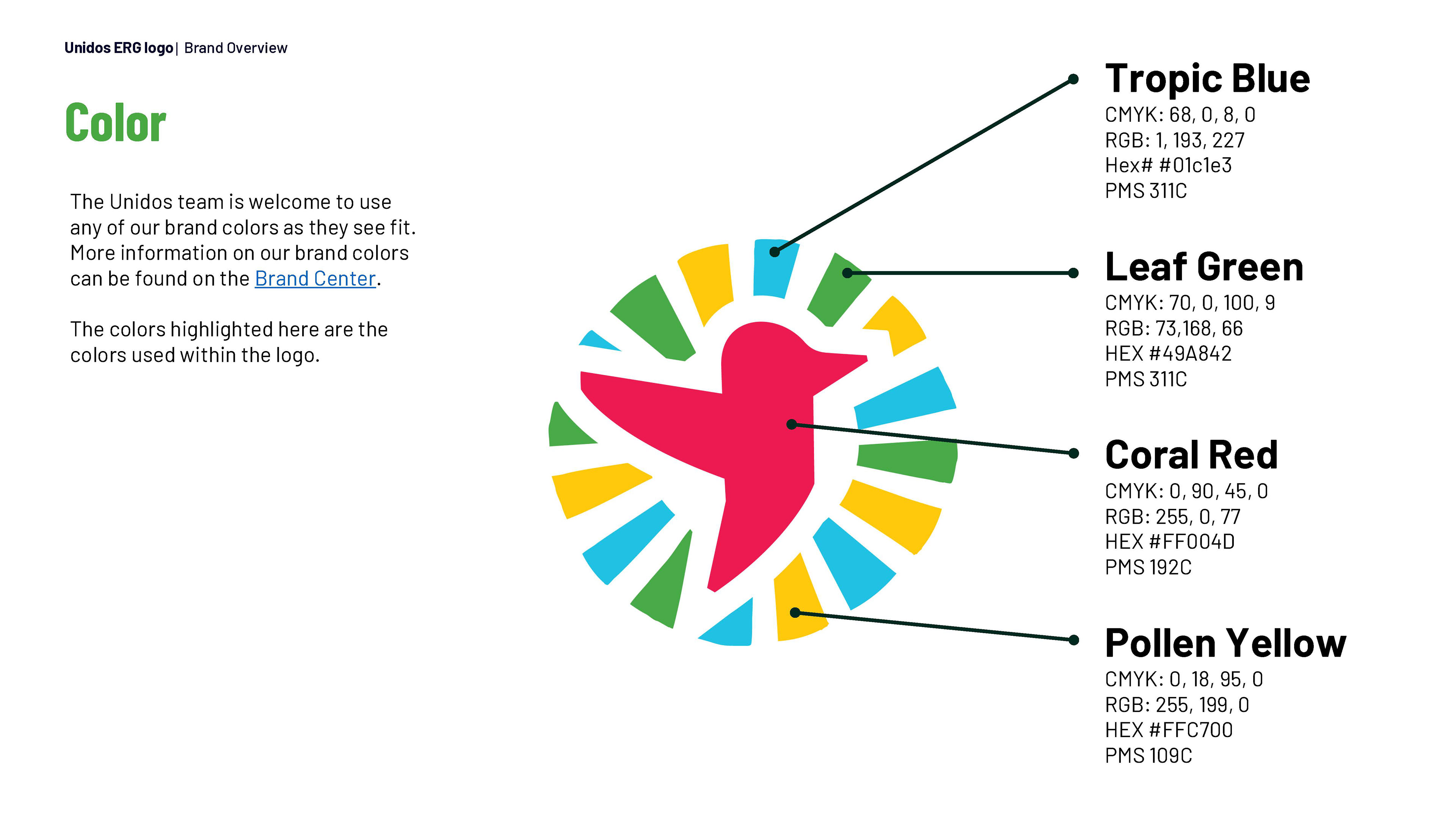
A bird that embodies the geometric nature of carvings became the emblem of this group to honor ancestral roots and a connection to nature. Much like a bird who sings, this logo represents the
amplification of voices globally. The figure also takes flight against rays of sunlight to represent a shared cultural identity that transcends borders.
amplification of voices globally. The figure also takes flight against rays of sunlight to represent a shared cultural identity that transcends borders.
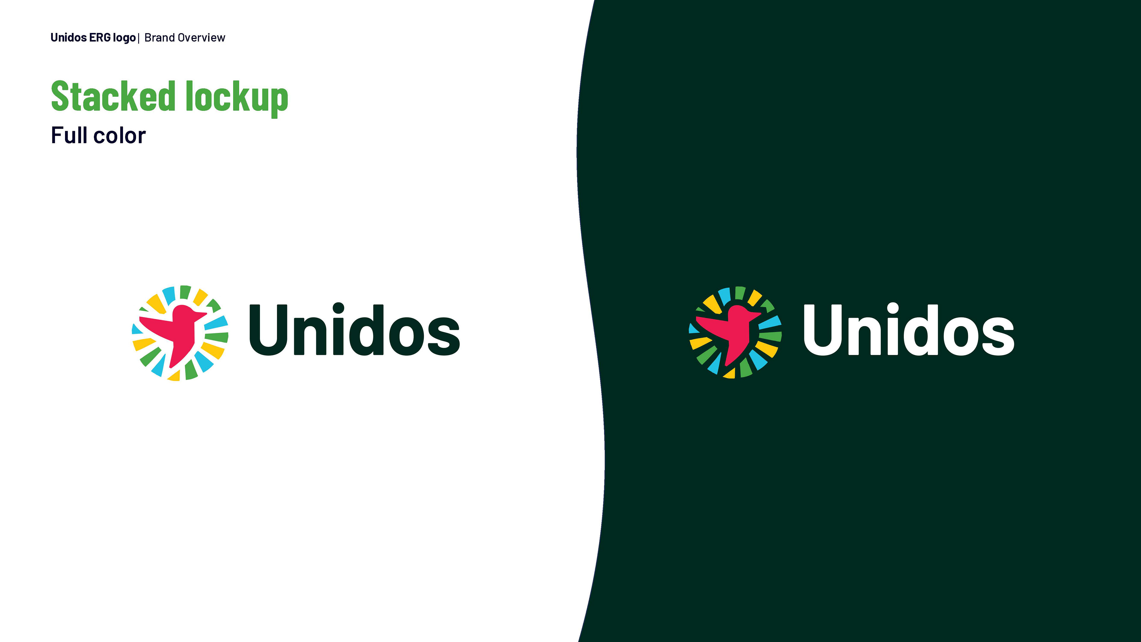
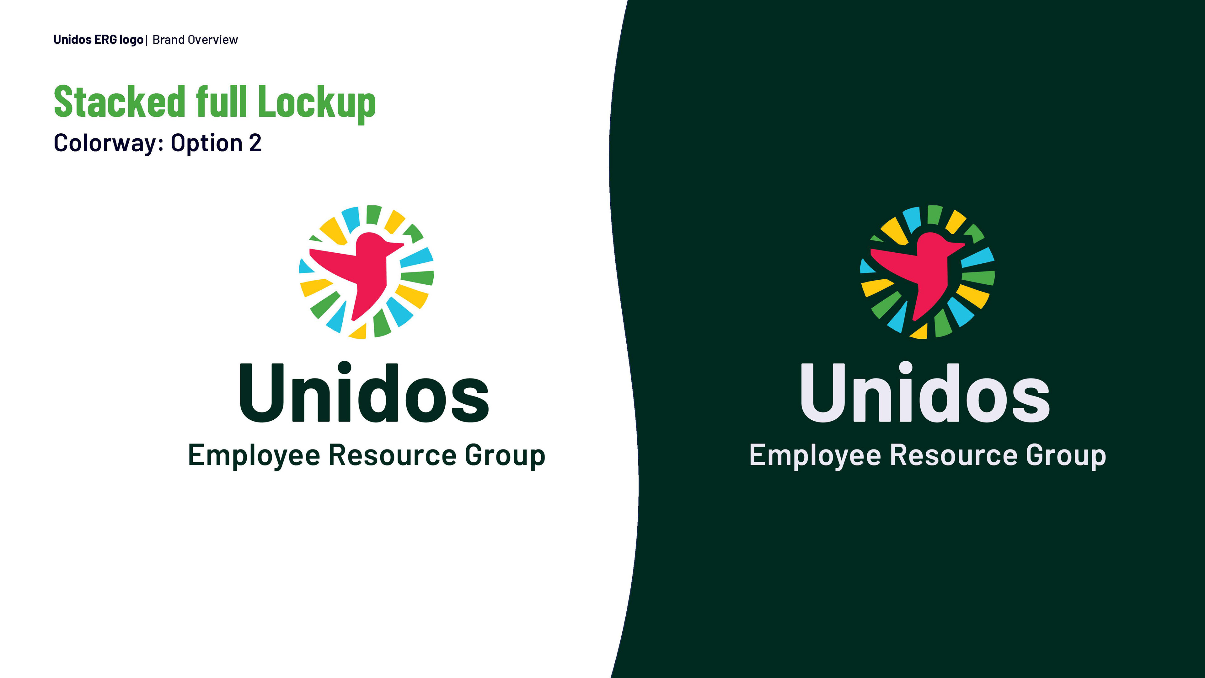
Designs were refined through team collaboration, evolving into a cohesive logo system. The process centered on translating insights into a clear, compelling brand mark that honors cultural traditions, contributions, and amplifies diverse voices across these communities. Both Spanish and Portuguese were integrated to support linguistic diversity through the name “UNIDOS” (“Together” in English) which was meant to capture the essence of unity and solidarity across borders.
Role: Graphic Designer
Additional contributors:
Graphic Designer: Savannah Jackson
The Nature Conservancy's Marketing Team
The Nature Conservancy's Marketing Team
The Nature Conservancy's 'Unidos' Group